Why You Need A Brand Board For Your Business
Branding tip
Why You Need To Be Using Pinterest
Biz Tip
My #1 Tip For Branding Your Business
Branding tip
The Importance of Defining Your Brand Personality
Branding Tip
Browse around
resources
Hey!
Brand design expert
I'm Ciera
I’ve been a graphic designer since 2006. Your business deserves amazing branding no matter what phase you’re in and I’m here to help!
Why You Need A Brand Board For Your Business
BRANDING TIP
Why You Need A Brand Board For Your Business
BIZ TIP
My #1 Tip For Branding Your Business
branding tip
The Importance of Defining Your Brand Personality
branding tip
DIY Your Brand
The Template Shop
Browse around
topics
Designing with Letterpress: A Webinar from PaperSpecs.
This webinar was educational and had wonderful examples from Judith Berliner (Full Circle Press) and Josh Chen (Chen Design Associates). Here are a few tips from what I learned today:
The Process:
– Know you press before you start your design and determine if the design is fit for the equipment – not all designs are right for letterpress
– film is created from your design
– a photopolymer plate is made using a light sensitive process
– printing begins
Considerations every designer should know:
Color and Ink:
– Work with solids and not screens of colors – 1 color at a time is important to remember
– Pantone books are printed offset so letterpress will look a bit heavier
– Designers should know how different papers influence color
– Minimum line weight should be .25 but preferably .50
Size and Runs:
– most printers have capabilities to run jobs from business card size to 21″ but size will depend on the press you have
– 250 minimum quantity for a run is suggested, but any quantity is possible
Paper:
– You can work with a family of papers for the same job
– Type of paper also determines the impression depth, 80 lbs is probably too thin – need thicker paper for deeper impressions
– Uncoated sheet: You can print on both smooth and textured paper (letterpress is almost always printed on an uncoated stock)
Coated paper: “It doesn’t really jive with the feel” as Josh says.
Special effects:

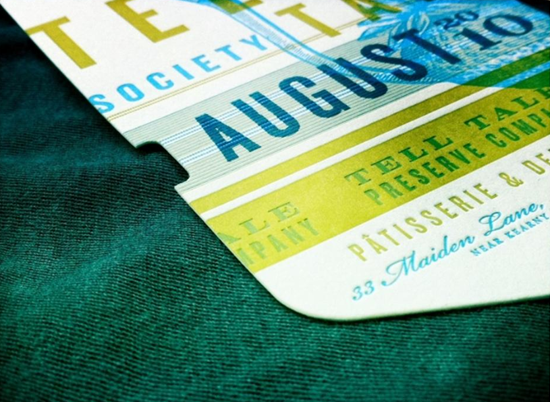
Example 1: A two color job with overprinting gives you more depth and more colors. Also, an additional color was added with a custom rubberstamp (stamped each month).

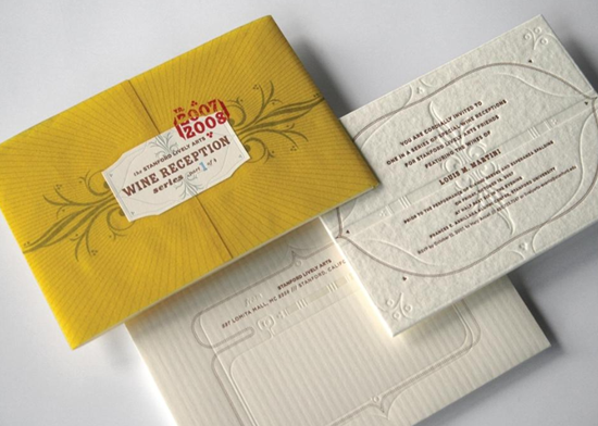
Example 2: A blind impression adds extra depth to a design.

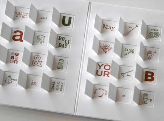
Example 3: Unique Applications – Advent Calendar
People say that print is dead. When you see these beautiful samples you know why they are wrong!
Tomorrows Flickr Friday will feature more Letterpress samples so stop by the blog to see those! If you have some letterpress samples I would love to see them, share your link below in the comments!
Images and content from PaperSpecs.
Pin
Share
Previous Story
next Story
Get the free guide to learn the top mistakes when it comes to DIY branding.
6 Ways Your DIY Branding May Be Hurting Your Business
Free Guide
© 2023 Ciera Holzenthal LLC, DBA Ciera Design Studio.
Get the free guide download by over 2,000 people!
Discover Your Brand Personality
Join Me on Insta
Nice article Ciera – PaperSpecs is quite the resource! Glad you were able to attend the webinar and share your writeup.
I’ve used Cranky Pressman to print some letterpress business cards and they came out really great! The Cranky Pressman website has lots of great letterpress info as well: http://www.crankypressman.com/cranky_pressman/working-with-letterpress.html
Here are some shots of the card they printed for me:
http://www.flickr.com/photos/clipcreative/4784138300/
http://www.flickr.com/photos/clipcreative/4783506819/
Keep up the great work!
Those cards look great, thanks for sharing!
[…] This post was mentioned on Twitter by Ciera Holzenthal, Ryan Colgin. Ryan Colgin said: RT @CieraHolzenthal: Designing with Letterpress – https://cieradesign.com/fa97 […]