Why You Need A Brand Board For Your Business
Branding tip
Why You Need To Be Using Pinterest
Biz Tip
My #1 Tip For Branding Your Business
Branding tip
The Importance of Defining Your Brand Personality
Branding Tip
Browse around
resources
Hey!
Brand design expert
I'm Ciera
I’ve been a graphic designer since 2006. Your business deserves amazing branding no matter what phase you’re in and I’m here to help!
Why You Need A Brand Board For Your Business
BRANDING TIP
Why You Need A Brand Board For Your Business
BIZ TIP
My #1 Tip For Branding Your Business
branding tip
The Importance of Defining Your Brand Personality
branding tip
DIY Your Brand
The Template Shop
Browse around
topics
A brand is many things (it’s an overall experience including perception, voice, values and visuals) but today we are mainly talking about your brand identity or the visual aspects of your brand.
What Is A Brand?
The core of branding your business is to first know your target audience. Your target audience is your ideal customer and client which is who is going to buy your products and services. Your branding needs to speak to THEM. You should put personal preferences aside and always put the people most likely to be interested in your product or service first.
You should have thought through all of this before designing a logo, picking fonts and colors and turning that into a brand board.
If you’re still working on your brand and visual identity, I recommend you check out these blog posts first, then come back here to build your brand board:
- My Best Tip for Branding Your B
usiness - The Importance of Defining Your Brand Personality
- 15 Questions to Answer Before Designing Your Logo
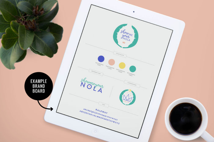
Once you’ve gone through that discovery phase and have your visual branding complete – we put all of those elements into a brand board which will help you to have a clear brand message as well as consistent brand visuals.
So you may be asking “what exactly is a brand board?” – Well, let’s dive into what it is and why you need one for your business.
What Is A Brand Board?
A brand board is a place to pull together all of your brand identity pieces in one neat place.
This is a simple document to make sure that everything you put out into the world for your business is consistent.
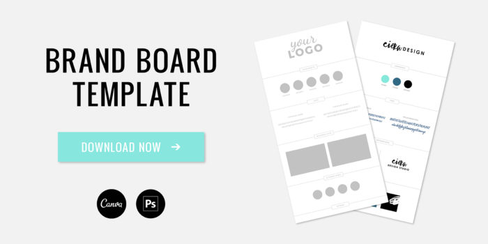
Why Your Business Needs a Brand Board
Being cohesive and consistent across all platforms is key to building trust with your customers.
Branding is one of the most important aspects of any business, large or small. Whether you hired a designer to create your logo and marketing items or you did it yourself – I know that you put a lot of time into this process.
Your website, business card, social media, and printed materials are often the first interface that a potential client has with your business. You have a few seconds to make a good impression and you should be proud to hand out cards and send people to your site.
With so many platforms these days, clients should be able to recognize you at a glance through your brand identity. Are your website, printed materials and social sites cohesive? They should be.
It can be tempting to stray towards a new trend or try out a new font but having your brand board created and front of mind will help keep your marketing items consistent!
It’s so easy to veer off in a random direction without this overall vision bringing it all back together.
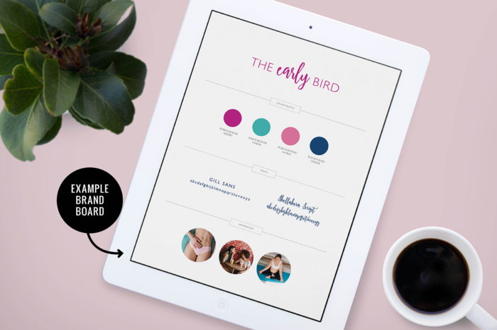
What To Include In Your Brand Board
1. Main logo
Your primary logo is the main identifying mark for your business. This logo will be used the
2. Secondary/Alternate Logos and Sub-Marks
From time to time it makes sense for a visual identity system to have an alternate logo or sub-mark. This could be a different orientation or a simplified version of the main logo to give your brand more flexibility. This logo can be helpful for social media profile images, on social media graphics, as a watermark and other places where you need to use a more compact version of your logo.
3. Color Palette
I typically create a color palette that consists of 3-5 colors. Your color choices should speak to your target audience, be relevant and memorable.
Elle and Company has a great post on creating a distinct color palette.
In addition to the colors themselves, make sure you include the color codes that you use most, hex codes for web and CMYK and PMS for print.
4. Fonts
My recommendation is to have two fonts for your brand identity.
By choosing fonts that reflect your brand’s values, you can attract the right kind of customers. A serif fonts tends to be more traditional while a sans serif has a more minimal and modern feel. You may also consider a bold slab-serif or a script font which can give a friendly and approachable feeling.
5. Supporting Pattern or Textures
This space is for additional design elements that will give your branding depth and interest. They can be used in social media templates or the background of your website, for example. Patterns and textures can add interest to your designs, support your brand message, gives versatility and helps your brand stand out even more.
6. Photography Style
You can also include photographs to make sure your content and editing
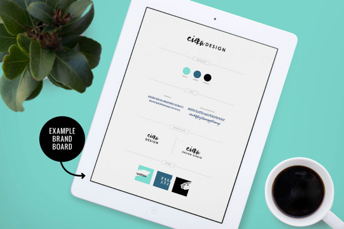
These elements make up a visual identity. Once you have the basics in place, you can use these elements to create social media graphics, PDFs, marketing collateral, website elements, and so much more.

Remember, being cohesive and consistent across all platforms is key to building trust with your customers and having all of your brand elements in one guide that you can reference at a glance is critical in keeping your branding on track.
Pin
Share
Previous Story
next Story
Get the free guide to learn the top mistakes when it comes to DIY branding.
6 Ways Your DIY Branding May Be Hurting Your Business
Free Guide
© 2023 Ciera Holzenthal LLC, DBA Ciera Design Studio.
Get the free guide download by over 2,000 people!
Discover Your Brand Personality
Join Me on Insta
Very interesting, this was something I didn’t really know much about. Thanks for sharing.
[…] what you’re missing is the brand board that puts your identity together across multiple channels and materials. Indeed, when you are only […]