Why You Need A Brand Board For Your Business
Branding tip
Why You Need To Be Using Pinterest
Biz Tip
My #1 Tip For Branding Your Business
Branding tip
The Importance of Defining Your Brand Personality
Branding Tip
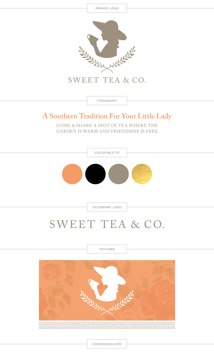
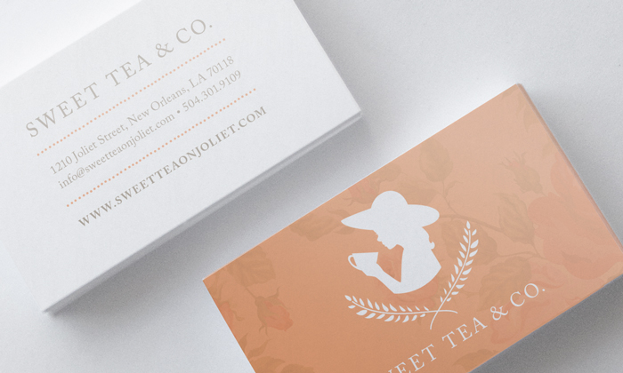
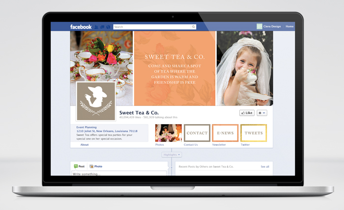
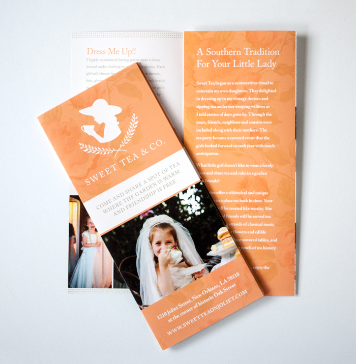
Design Portfolio: Sweet Tea Logo and Branding

Posted In
January 6, 2014
Posted On
Previous Story
next Story
Get the free guide to learn the top mistakes when it comes to DIY branding.
Brand Resource


Ciera! I looove! This is so beautiful : )
thank you so much Melanie!!
The peachy/orange color is fantastic for this branding. Would love to see how you incorporate the gold foil into the brand on any print work. Great job Ciera 🙂
Thanks Angel! Crossing my fingers that I get to use gold foil at some point!
Wow! This turned out gorgeous! I love how you did the orange with the pattern behind it! So, so great!
Thank you Kory, this was a really fun one to work on!