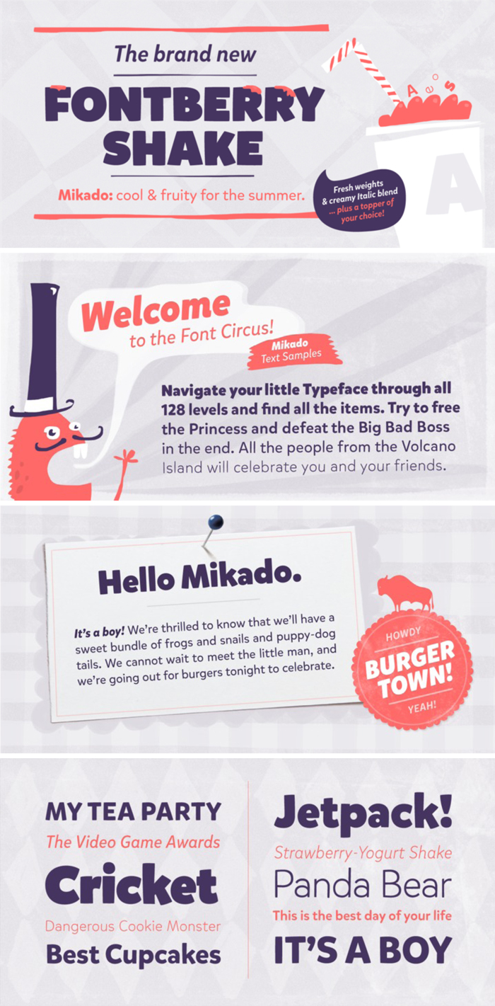
Happy Friday! I have a new favorite font for you guys! Looking at this font just makes me happy. It makes me feel like a fun summer is approaching and I just want to go eat snoballs, ride a ferris wheel and lay out on the beach!
Mikado is a friendly, casual type family designed by Hannes von Döhren. It is intended to be used everywhere where a pleasant feeling should be conveyed. It has the openness and regularity needed for agreeable reading, and a lively and informal appearance that makes it shine in large headlines, slogans and logos. Mikado has a positive, kind of “out-of-the-box-appearance” in big sizes, but because of its straight architecture the fonts are also very legible in smaller sizes and longer texts – in print or on screen.
Mikado is equipped for complex, professional typography with alternate letters, ligatures, arrows, fractions and an extended character set to support Central and Eastern European as well as Western European Languages. Love Potion and Brandon Grotesqu, two of Hannes von Döhren‘s other fonts have shown up on this blog before as favorites!

Description and samples from MyFonts.

Mikado is a superb font that is very impressive in graphic design. The use of this font can enhance the attraction of your designs, so consider Mikado while creating your website.
The font style is a very important factor in graphic designing that creates different look of your design. There are only few fonts that do this and Mikado is one of them. I like it!
Love. This. I’m always up for a little font porn. Guess I’ll have to head over and purchase it. 🙂
glad you like!
Nice font! I love that is is clean and it shows up small! It’s kind of retro too – thanks for sharing it!
no problem!