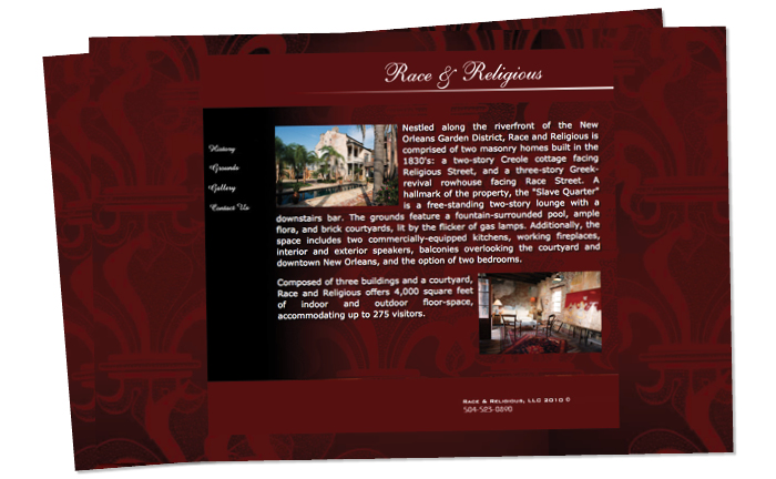
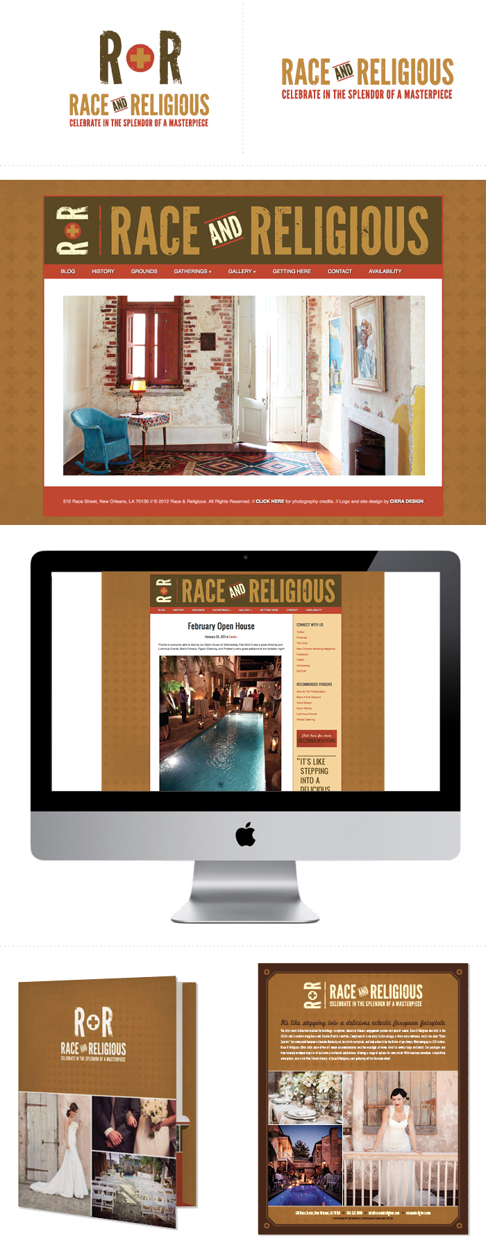
About two years ago I was contacted to design a new logo for Race and Religious, an absolutely beautiful event venue in New Orleans. After the logo was completed we moved forward with the web site and have been creating new items to build their brand ever since! I have designed information folders, maps, their website and blog, site and floor plans and ads. I really enjoy working on projects where I get to create an overall look and then apply my concept to multiple designs. I started the process by sending a Q&A to help determine the exact look they were going for.


 As the owner of Race & Religious we couldn’t have been more satisfied with all that Ciera has accomplished for us. Because of her designs for our logo and website we feel that we have become internationally recognized as one of the most eclectic, beautiful, funky places to have an event in New Orleans. She was able to incorporate the ambiance thru our website and logo that is signature to our location, and renovation of our 1835 historical houses situated at Race and Religious Streets in the warehouse district of New Orleans. We are so proud to hand out our cards eluding to the website that is unique and embodies the mystery of what is yet to be seen at Race & Religious. We feel that it is because of Ciera’s design ability that we have been named by Travel and Leisure as one of the coolest rental houses and also by Martha Stewart Wedding Magazine as one of the most spectacular wedding venues available. All this in less than three years of operating! -Billie and Gran Semmes | Owner, Race and Religious


Race and Religious live site and check out some photos from my visit to the venue!


Great work! Love the tone you set with the colors, texture and fonts. My question is, who made the first move? Did they approach you or did you approach them to get the redesign started? I want to get more freelance business in my local area and I’m not sure if I should be dancing into a business touting that they need a web-makeover.
Thank you Meghan! One of their photographer recommended me for a designer. At first I did a few brochures and posters for them with the old brand. We clicked and worded really well together so then they asked about a new website, and then a new logo, which is when I recommended a ‘rebrand’ rather than just a new logo on top of the old look! Hope that helps! Luckily, word of mouth has been a huge help for my business.
What an amazing transformation! Kudos!
Thank you Dawnielle!
Oh wow incredible!!!!!!!
thanks dear!