

Why You Need A Brand Board For Your Business
Branding tip

Why You Need To Be Using Pinterest
Biz Tip

My #1 Tip For Branding Your Business
Branding tip
The Importance of Defining Your Brand Personality
Branding Tip


Brandon Grotesque Font [Friday Favorites]
Posted In
September 21, 2012
Posted On
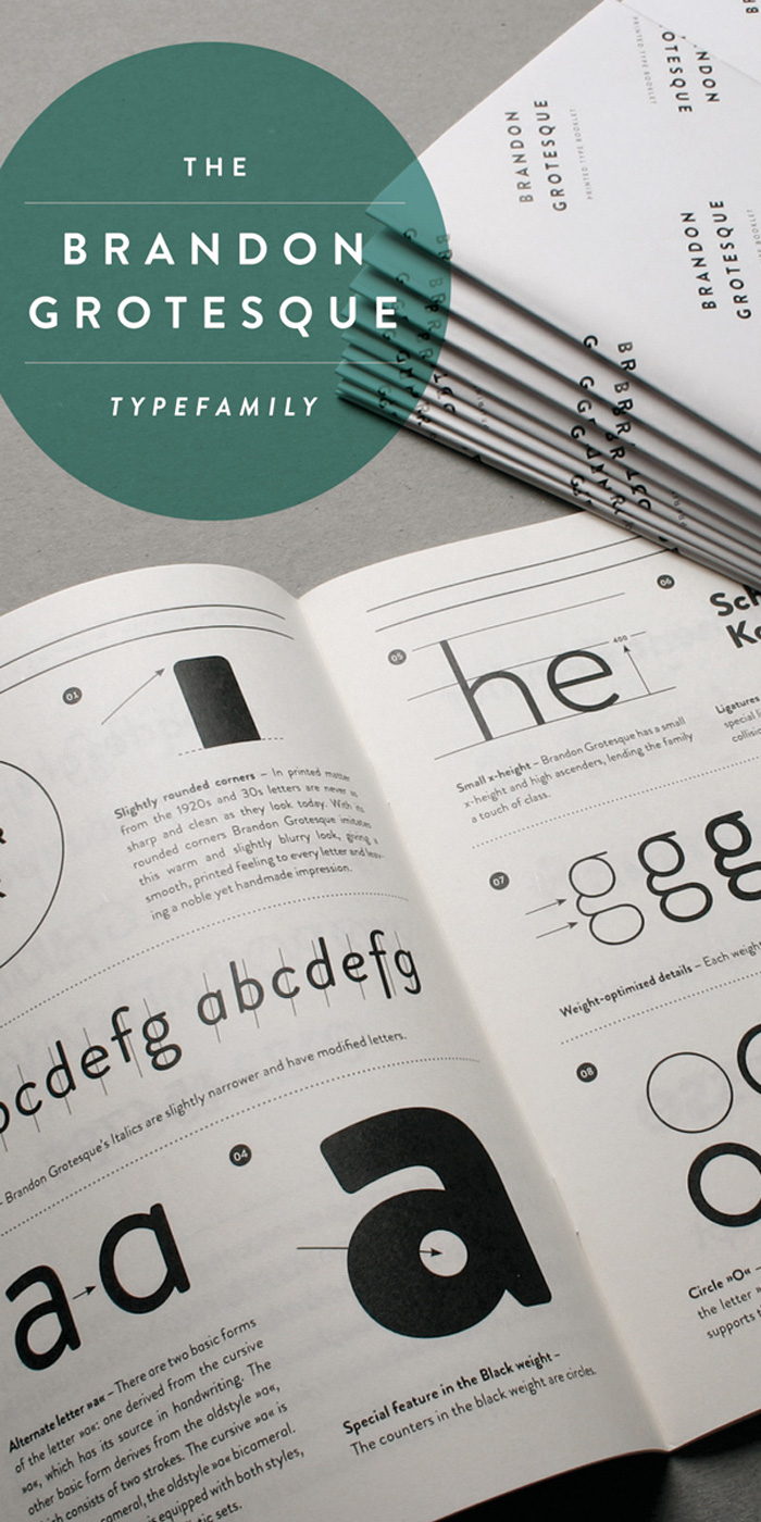
A new favorite font for y’all today! Brandon Grotesque is a sans serif type family of six weights plus matching italics. It was designed by Hannes von Döhren. Influenced by the geometric-style sans serif faces that were popular during the 1920s and 30s, the fonts are based on geometric forms that have been optically corrected for better legibility.
Brandon Grotesque has a functional look with a warm touch. While the thin and the black weights are great performers in display sizes the light, regular and medium weights are well suited to longer texts. The small x-height and the restrained forms lend it a distinctive elegance. You can grab Brandon Grotesque from MyFonts.

Description and samples from MyFonts.
Pin
Previous Story
next Story

Get the free guide to learn the top mistakes when it comes to DIY branding.
6 Ways Your DIY Branding May Be Hurting Your Business
Free Guide


