Why You Need A Brand Board For Your Business
Branding tip
Why You Need To Be Using Pinterest
Biz Tip
My #1 Tip For Branding Your Business
Branding tip
The Importance of Defining Your Brand Personality
Branding Tip
Previous Story
next Story
Get the free guide to learn the top mistakes when it comes to DIY branding.
Brand Resource
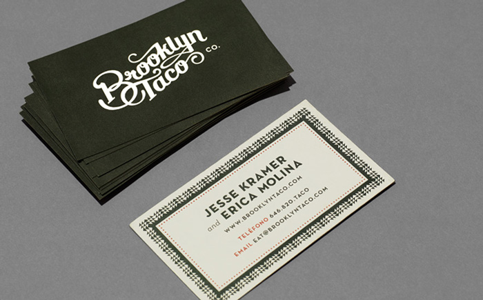
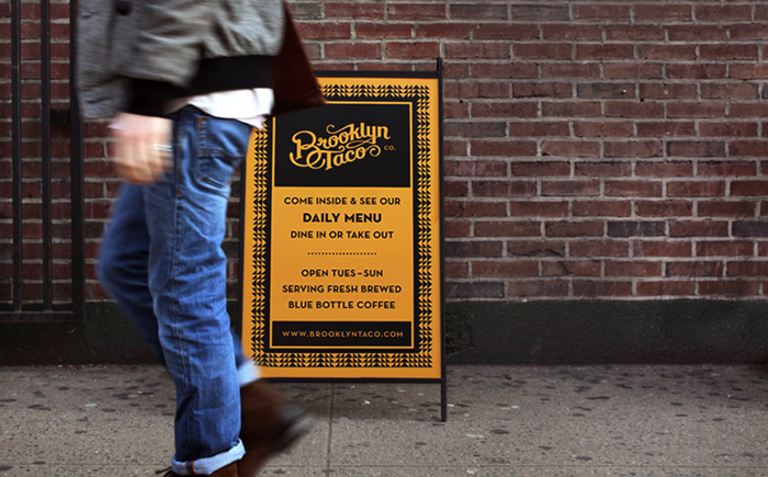
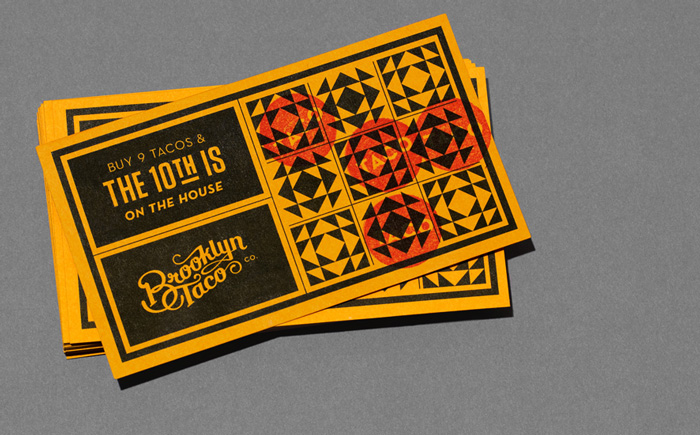
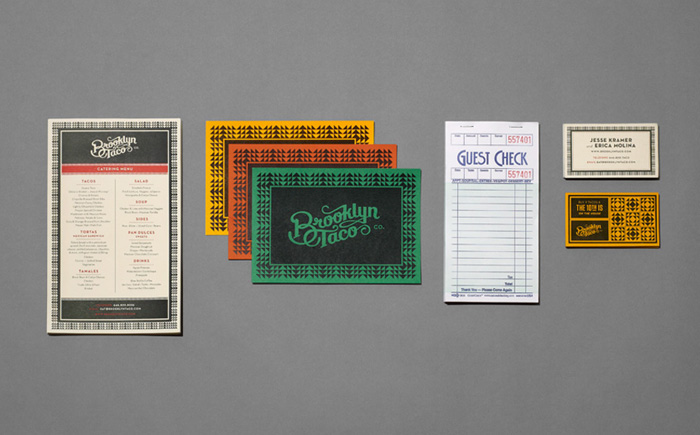

I love it all. The taco card is so cute!
omg these graphics are beautiful. but more importantly, where is this taco joint? i must go now!
I know, I bet they are delicious! I may have to find it next time I’m in New York!
I love how all the elements flow together without being super matchy matchy.
yes! they did a really great job at that!
I Love these business card designs!
yes they are really great! Tag does great work!