Why You Need A Brand Board For Your Business
Branding tip
Why You Need To Be Using Pinterest
Biz Tip
My #1 Tip For Branding Your Business
Branding tip
The Importance of Defining Your Brand Personality
Branding Tip
Previous Story
next Story
Get the free guide to learn the top mistakes when it comes to DIY branding.
Brand Resource
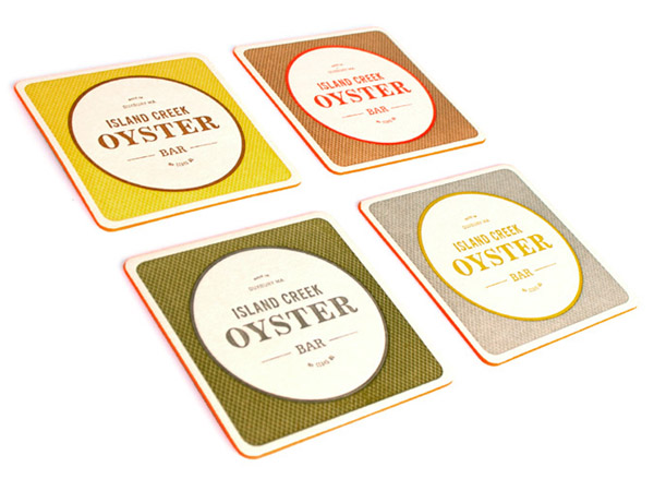
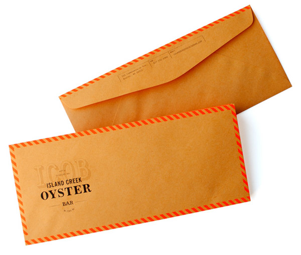
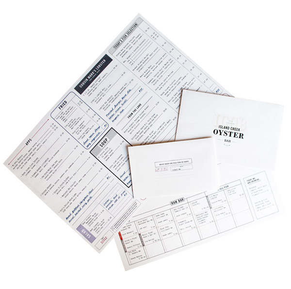
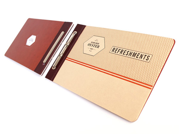
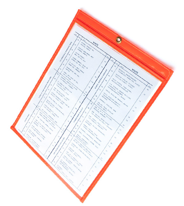
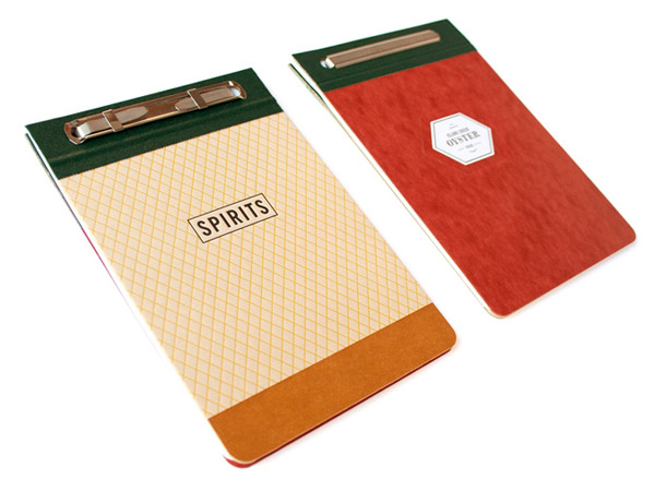
I love everything about these designs! Love the colors.
The plastic sleeves with the colored border are called job jackets. You see them a lot in manufacturing, and can buy them at http://www.uline.ca/BL_801/Job-Ticket-Holders
That is where we ordered them for this project. Have fun.
Rory
thanks for the info Rory!
Great design makes my heart SO happy. These are fantastic!
Oooooh, I love it too, especially the envelopes! Good find. Random question, the red page protector, do you know what those are called or where to find them? I’ve been trying to recreate something I saw years ago in Domino mag but never knew where to get them.
Brianna, I looked around a bit and did not find anything like that red page protector, sorry!
Oh! I wish I lived close enough to try this place out.. totally pinning some of these pics! thanks
Brianne
I love the way your blog looks! Very clean and easy to navigate.
thanks Shawna 🙂
LOVE those colors, the coasters are great with the red edges!Thanks for sharing!