I’m really enjoying the simplicity of this brand for The National – an all-occasion “grand café” inspired by London cafés and French bistros, but with a unique, New York City twist.
Love and War, a branding and advertising agency, developed the visual identity including a minimal wordmark logo and a beautiful abbreviated alternate. The agency also created the website, promotions, illustrations and a range of in-restaurant materials from menus to tableware.
Simple is extremely hard to do well, but Love and War nailed it and I’m not the only one who thinks so. The agency was awarded a 2011 James Beard Award of Outstanding Graphics for this work. What do you think about this identity?
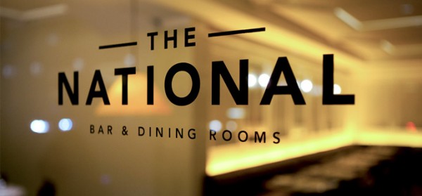

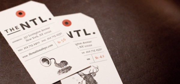
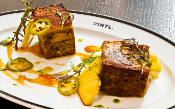
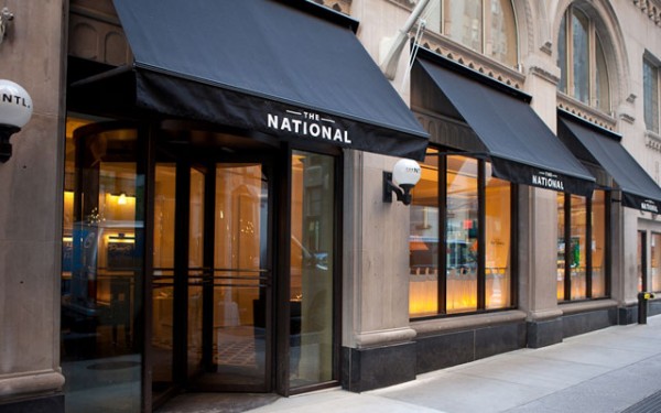
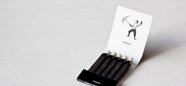
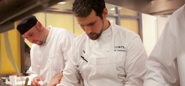
Photos from Love and War and The National.


[…] Neutrals with a touch of mint2 // Exploring Arnold Arboretum3 // Design freebies from me to you4 // The National Branding by Love and War5 // Populaire – Favorite Font6 // Boston Photo Tour – The North End7 // Golden Half […]